
A gif from ‘Beautiful in English
The latest in our series of data visualisation projects sees Shirley Wu and Nadieh Bremer apply their unique take on life to Google data. The pair together make up Datasketch.es. Shirley is based in San Francisco, Nadieh in Amsterdam, and the two regularly produce complementary work that tells beautiful stories.
This month, in the latest in our visual series, we have not one but two visuals, as the team looked at Google data we haven’t explored before: translations and culture searches.
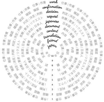
In Beautiful in English, Nadieh reveals the top searched words in Google Translate from different languages. She explores how the words vary from the mundane to the sublime, and notes a common current of optimism through a number of the languages.
6 out of the 10 languages have a positive vibe going on, with 3 of them wanting to know the translation for good while the most often translated word across all languages is beautiful, or, as they say in Italian, bella
And in the complementary visual, explore-adventure.com, Shirley looks at the top searched cultural locations in different countries. She examined the thousands of cultural and tourism searches that take place on Google and illustrates how different countries search in unique ways. For instance, cities are the most searched cultural destinations. But the searches also vary season by season.
Nadieh and Shirley have different styles but one thing radiates from their work: humanity.
Traditionally, a lot of data journalism and data visualisation has not been big on emphasising humanity. Former New York Times developer Jacob Harris wrote a prescient piece in 2015 calling for more empathy in data journalism. He cited ProPublica’s Scott Klein in talking about the importance of the ‘near’ view, in addition to the ‘far’ view that data journalism often takes. In other words, data journalism can often seem abstract and removed from your personal life. Bringing it closer, the ‘near’ view, is what makes it real and concrete. It’s the difference between flying over a place and remarking how the cars look like toys and being there on the road in the back seat of a taxi. One is remote and removed, the other is happening to you.
Typically, data journalism is often paired with traditional narrative reporting, which can focus on teasing out the empathy part of the equation. That leaves the data work feeling anonymous and impersonal. But in a world where visuals have to stand alone, that is no longer adequate. Wrote Harris:
the main question is this: should we even try with our graphics to make readers care? The Devil’s Advocate would argue that it’s not the responsibility of our interactives to make people feel something about a topic — that is usually handled by a narrative piece paired with them — but I feel that in these days where charts may be tweeted, reblogged, and aggregated out of context, you must assume your graphic will stand alone. Neither of these arguments consider what the reader actually expects. What does the reader expect to feel from journalism and how can we learn from their experiences?
Two years is a long time in data. Now, empathy is at the heart of some of the most innovative data journalism and visualisation around. Take the work of Mona Chalabi, for instance, in which she brings her hand-drawn analysis to bear on issues ranging from politics to sex without ever dumbing-down or patronising.
A few weeks ago, data artist Giorgia Lupi gave a Ted talk showing how data can bring us closer to ourselves, how we can find ourselves in that data. It has hit a nerve, with more than half a million views to date. In WorldPotus, which Giorgia and her partners produced as part of our data visualisation project, they used Search data to explore how the rest of the world searched for the 2016 US Presidential election. It was playful, fun, and smart, reflecting the uncertainty and nuance of the data itself.
This is where art and data visulisation blur, and maybe it has always been so. Minard’s famous visual exploration of the French army’s retreat from Moscow is both data visual and artwork, a piece that tells us as much about ourselves and our reaction to it as it does about the subject at hand. To some, it’s the best dataviz ever produced. Personally, I love how it tells a story — but for me it’s simply beautiful, and that’s enough.
Which is where Shirley and Nadieh’s work takes us. The latest in our series, produced with artistic direction from Alberto Cairo, showcases data we have never visualised before and does it in a way which is human, beautiful, and above all, fun. And that is something we need more of in data journalism.
You can read more about our data visualisation project on FastCo.


Discussion
No comments yet.