
Analyze with BigQuery data canvas
To provide feedback or request support for BigQuery Studio data canvas, send an email to [email protected].
BigQuery Studio data canvas lets you find, transform, query, and visualize data by using natural language prompts and a graphic interface for analysis workflows.
For analysis workflows, BigQuery data canvas uses a directed acyclic graph (DAG), which provides a graphical view of your workflow. In BigQuery data canvas, you can iterate on query results and work with multiple branches of inquiry in a single place.
BigQuery data canvas is designed to help you with your data-to-insights journey. You can work with data without needing technical knowledge of specific tools or products. BigQuery data canvas works with Dataplex metadata to identify appropriate tables based on natural language.
BigQuery data canvas uses Gemini to find your data, create SQL, generate charts, and create data summaries.
Capabilities
BigQuery data canvas lets you do the following:
Use keyword search syntax along with Dataplex metadata to find assets such as tables, views, or materialized views.
Use natural language for basic SQL queries such as the following:
- Queries that contain
FROMclauses, math functions, arrays, and structs. JOINoperations for two tables.
- Queries that contain
Visualize data by using the following types graphic types:
- Bar chart
- Heat map
- Line graph
- Pie chart
- Scatter chart
Create custom visualizations by using natural language to describe what you want.
Automate data insights.
Limitations
Natural language commands might not work well with the following:
- BigQuery ML
- Apache Spark
- Object tables
- BigLake
INFORMATION_SCHEMAviews- JSON
- Nested and repeated fields
- Complex functions and data types such as
DATETIMEandTIMEZONE
Data visualizations don't work with geomap charts.
Before you begin
- Ensure that Gemini in BigQuery is enabled for your Google Cloud project. An administrator typically performs this step. For more information, see Set up Gemini in BigQuery.
- Ensure that you have the necessary Identity and Access Management (IAM) permissions to use BigQuery data canvas.
Required roles
To get the permissions that you need to use BigQuery data canvas, ask your administrator to grant you the following IAM roles on the project:
-
BigQuery Studio User (
roles/bigquery.studioUser) -
Cloud AI Companion User (
roles/cloudaicompanion.user)
For more information about granting roles, see Manage access.
You might also be able to get the required permissions through custom roles or other predefined roles.
For more information about IAM roles and permissions in BigQuery, see Introduction to IAM.
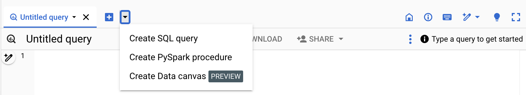
Use BigQuery data canvas
You can use BigQuery data canvas in the Google Cloud console, a query, or a table.
Go to the BigQuery page.
Click Create Data canvas.
In the Natural language prompt field, enter a natural language prompt.
For example, if you enter
Find me tables related to trees, BigQuery data canvas returns a list of possible tables, including public datasets likebigquery-public-data.usfs_fia.plot_treeorbigquery-public-data.new_york_trees.tree_species.Select a table.
A table cell for the selected table is added to BigQuery data canvas. To view schema information, view table details, or preview the data, select the various tabs in the table cell.
Try example workflows
This section demonstrates different ways to use BigQuery data canvas in analysis workflows.
Example workflow: Find, query, and visualize data
In this example, you use natural language prompts in BigQuery data canvas to find data, generate a query, and edit the query. Then, you create a chart.
Prompt 1: Find data
In the Google Cloud console, go the BigQuery page.
Click Create Data canvas.
In the Natural language prompt field, enter the following natural language prompt:
Chicago taxi tripsBigQuery data canvas generates a list of potential tables based on Dataplex metadata. You can select multiple tables.
Select
bigquery-public-data.chicago_taxi_trips.taxi_tripstable, and then click Add to canvas.A table cell for
taxi_tripsis added to BigQuery data canvas. To view schema information, view table details, or preview the data, select the various tabs in the table cell.
Prompt 2: Generate a SQL query in the selected table
To generate a SQL query for the
bigquery-public-data.chicago_taxi_trips.taxi_trips table, do the following:
In the data canvas, click Query.
In the Natural language prompt field, enter the following:
Get me the 100 longest tripsBigQuery data canvas generates a SQL query similar to the following:
SELECT
  taxi_id,
  trip_start_timestamp,
  trip_end_timestamp,
  trip_miles
FROM
  `bigquery-public-data.chicago_taxi_trips.taxi_trips`
ORDER BY
  trip_miles DESC
LIMIT
  100;
Prompt 3: Edit the query
To edit the query that you generated, you can manually edit the query, or you can change the natural language prompt and regenerate the query. In this example, you use a natural language prompt to edit the query to select only trips where the customer paid with cash.
In the Natural language prompt field, enter the following:
Get me the 100 longest trips where the payment type is cashBigQuery data canvas generates a SQL query similar to the following:
SELECT
  taxi_id,
  trip_start_timestamp,
  trip_end_timestamp,
  trip_miles
FROM
  `project_id.chicago_taxi_trips_123123.taxi_trips`
WHERE
  payment_type = 'Cash'
ORDER BY
  trip_miles DESC
LIMIT
  100;
To view the results of the query, click Run.
Create a chart
- In the data canvas, click Visualize.
Click Create bar chart.
BigQuery data canvas creates a bar chart showing the most trip miles by trip ID. Along with providing a chart, BigQuery data canvas summarizes some of the key details of the data backing the visualization.
Optional: Do one or more of the following:
- To modify the chart, click Edit, and then edit the chart in the Edit visualization pane.
- To share the data canvas, click Share, then click Share Link to copy BigQuery data canvas link.
- To clean up the data canvas, select more_vert More actions, and then select gavel Clear canvas. This step results in a blank canvas.
Example workflow: Join tables
In this example, you use natural language prompts in BigQuery data canvas to find data and join tables. Then, you export a query as a notebook.
Prompt 1: Find data
In the Natural language prompt field, enter the following prompt:
Information about treesBigQuery data canvas suggests several tables that have information about trees.
For this example, select the
bigquery-public-data.new_york_trees.tree_census_1995table, and then click Add to canvas.The table is displayed on the canvas.
Prompt 2: Join the tables on their address
On the data canvas, click Join.
BigQuery data canvas suggests tables to join.
To open a new Natural language prompt field, click Search for tables.
In the Natural language prompt field, enter the following prompt:
Information about treesSelect the
bigquery-public-data.new_york_trees.tree_census_2005table, and then click Add to canvas.The table is displayed on the canvas.
On the data canvas, click Join.
In the On this canvas section, select the Table cell checkbox, and then click OK.
In the Natural language prompt field, enter the following prompt:
Join on addressBigQuery data canvas suggests the SQL query to join these two tables on their address:
SELECT
  *
FROM
  `bigquery-public-data.new_york_trees.tree_census_2015` AS t2015
JOIN
  `bigquery-public-data.new_york_trees.tree_census_1995` AS t1995
ON
  t2015.address = t1995.address;
To run the query and view the results, click Run.
Export query as a notebook
BigQuery data canvas lets you export your queries as a notebook.
- In the data canvas, click Export as notebook.
- In the Save Notebook pane, enter the name for the notebook and the region where you want to save it.
- Click Save. The notebook is created successfully.
- Optional: To view the created notebook, click Open.
Example workflow: Edit a chart by using a prompt
In this example, you use natural language prompts in BigQuery data canvas to find, query, and filter data, and then edit visualization details.
Prompt 1: Find data
To find data about US names, enter the following prompt:
Find data about USA namesBigQuery data canvas generates a list of tables.
For this example, select the
bigquery-public-data.usa_names.usa_1910_currenttable, and then click Add to canvas.
Prompt 2: Query the data
To query the data, in the data canvas, click Query, and then enter the following prompt:
Summarize this dataBigQuery data canvas generates a query similar to the following:
SELECT
  state,
  gender,
  year,
  name,
  number
FROM
  `bigquery-public-data.usa_names.usa_1910_current`
Click Run. The query results are displayed.
Prompt 3: Filter the data
- In the data canvas, click Query these results.
To filter the data, in the SQL prompt field, enter the following prompt:
Get me the top 10 most popular names in 1980BigQuery data canvas generates a query similar to the following:
SELECT
  name,
  SUM(number) AS total_count
FROM
  `bigquery-public-data`.usa_names.usa_1910_current
WHERE
  year = 1980
GROUP BY
  name
ORDER BY
  total_count DESC
LIMIT
  10;
When you run the query, you get a table with the ten most common names of children born in 1980.
Prompt 4: Create and edit a chart
In the data canvas, click Visualize.
BigQuery data canvas suggests several visualization options, including a bar chart, pie chart, line graph, and custom visualization.
For this example, click Create bar chart.
BigQuery data canvas creates a bar chart similar to the following:
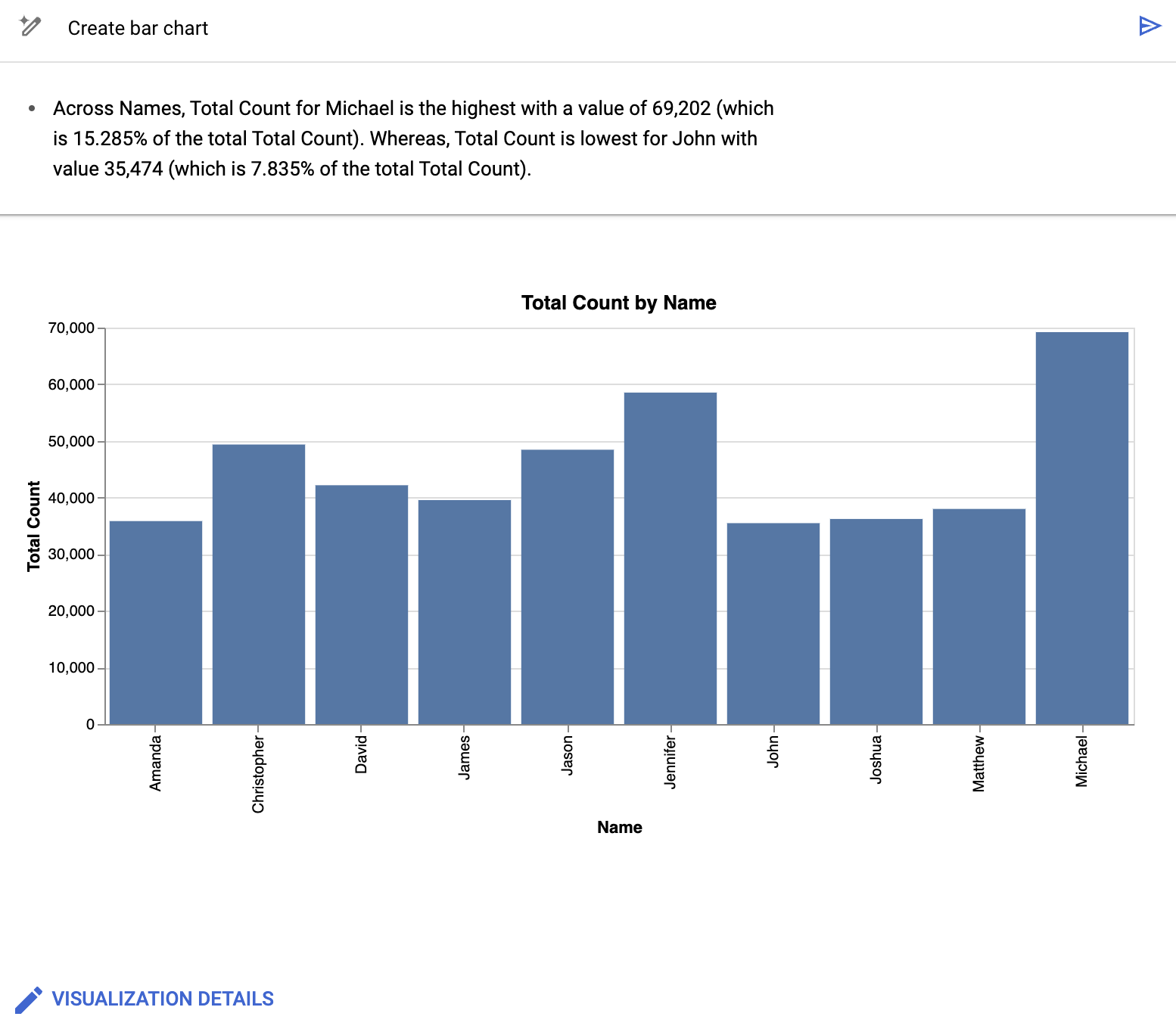
Along with providing a chart, BigQuery data canvas summarizes some of the key details of the data backing the visualization. You can modify the chart by clicking Visualization details and editing your chart in the side panel.
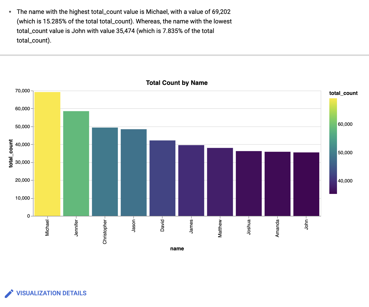
Prompt 5: Edit visualization details
In the Visualization prompt field, enter the following:
Create a bar chart sorted high to low, with a gradientBigQuery data canvas creates a bar chart similar to the following:
Optional: To make further changes, click Edit.
The Edit visualization pane is displayed. You can edit details such as the chart title, x-axis name, and y-axis name. Also, if you click the JSON Editor tab, you can directly edit the chart based on the JSON values.
Pricing
You are charged according to the compute- or storage-based pricing model while working with BigQuery data canvas. There are no additional charges for using Gemini with BigQuery data canvas during Preview.
Provide feedback
You can help improve BigQuery data canvas suggestions by submitting feedback to Google. To provide feedback, do the following:
In the Google Cloud console toolbar, click Submit feedback.
Optional: To copy the DAG JSON information to provide additional context to your feedback, click Copy.
To fill out the form and provide feedback, click form.
Data sharing settings apply to the entire project and can only be set by a
project administrator who has the serviceusage.services.enable and
serviceusage.services.list IAM permissions. For more
information about data use in the Trusted Tester Program, see
Gemini in Google Cloud Trusted Tester
Program.
To provide direct feedback about this feature, you can also contact [email protected].
What's next
Learn how to write queries with Gemini assistance.
Learn how to create notebooks.