Telerik & Kendo UI Theme BuilderTelerik & Kendo UI Theme Builder

ThemeBuilder

Styling Your Components Has Never Been Easier

Welcome to ThemeBuilder: The powerful Telerik and
Kendo UI theme builder.

*Supported for all Telerik and Kendo UI web components except UI for ASP.NET AJAX

waves-video-mid-section-bg

Need to Style Your UI Components - Meet ThemeBuilder

Control the look and feel of your UI components to fit any brand or application styles. ThemeBuilder is here to help you style your Telerik and Kendo UI components to perfectly match your design requirements.

Telerik & Kendo UI Theme Builder
decor-wavy

Save Time Theming Your Web UI Components

Reduce the time spent on styling to focus on the critical business logic of your applications. ThemeBuilder is a visual tool with almost zero learning curve that enables you to style your Telerik and Kendo UI web components without the need to write complex CSS rules.

5 Built-in Themes

Ready-to-use themes offered with Telerik and Kendo UI : Material, Bootstrap, Fluent, Default and Classic.

ThemeBuilder App

Style every element of your Telerik and Kendo UI components—from the high-impact primary color to the smallest visual details.

Unite UX Section Decoration Bracket

Feature-Rich UI Theming: From High-Impact to Atomic Styling

ThemeBuilder enables you to style everything from top-level elements like the primary color that applies to multiple components to atomic customizations that can style only the button text in the Data Grid.

Highlights

Custom SASS Variables

You can create multiple new SASS variables. When you need to change its style, you only need to change the variable in a single place instead of all components that use it.

Atomic Customizations

Customize every part of the component even the smallest part of each component. That gives you complete control over the component styles.

Figma Import

Boost productivity and teamwork by incorporating SASS/CSS variables from Figma into ThemeBuilder. Import design tokens such as colors, typography, and effects.

More Features
  • Project Sharing

  • Component Variants

  • Color and Size Variables

  • Consistent Styling

  • SSO

  • Figma Variable Modes

  • Custom Fonts and Icons

  • User Access Rights

  • Generic HTML Styling

Get Started with Telerik and Kendo UI ThemeBuilder

Telerik & Kendo UI Theme Builder

Pricing

Get access to the features that your team needs to satisfy your styling requirements.

pricing-grid-background

ThemeBuilder

  • 1 project
  • High-level SASS variable customizations
  • Ready-to-use swatches for dark mode and more


Available for free with your existing
Telerik account

Log in

ThemeBuilder Pro

  • Everything in the free tier
  • Detailed styling customization for each component part and state
  • Adding custom SASS variables
  • Sharing the projects and working together with your team
  • Uploading and using custom fonts and font icons
  • Manual migration support

Lite Support

72h response time
10 support incidents

$ 199

per user per year

Buy Now
Most Popular

ThemeBuilder Ultimate

  • Everything in the Pro tier
  • Unlimited projects
  • Figma import
  • Automatic migration
  • Component Variants
  • Multiple Projects Modes (Light and Dark Mode)

Priority Support

24h response time
Unlimited Support Incidents

$ 349

per user per year

Buy Now

ThemeBuilder Enterprise

  • Everything in the Ultimate tier
  • Unlimited projects
  • Access Rights
  • Single Sign-On support

Ultimate Support

Everything in Priority Support
Phone support
Remote web assistance


Contact us

What’s New with ThemeBuilder

themebuilder-smart-code-editor-thumbnail-370x200

Smart Code Editor

Working on custom styling? With the new Smart Code Editor, power users writing complex styles can now not only edit the CSS directly inside ThemeBuilder, but also view both the default theme styles and any customizations side-by-side.

themebuilder-styling-component-appearance-options

Support for Styling Component Appearance Options

ThemeBuilder now supports all Button & TextBox component variants through a streamlined user interface. You can now create the custom component version you need with different appearances and only view and edit the variants you’re using.
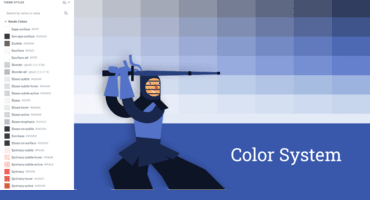
kendo-ui-color-system

New Kendo UI Theme Color System Support

Enjoy dozens of new dynamic colors in ThemeBuilder. Encompassing our Default, Material, Bootstrap and Fluent themes, the new color system aligns perfectly with design system methodologies, ensuring visual consistency across your applications.