


You may assume that everyone perceives colors or text legibility the same as you. The way in which we perceive color can depend on our environment (low or bright lights) and our vision capabilities. You or your users may be among the millions of people with color blindness or low vision.
To support people with various visual disabilities, the WAI group created a color contrast formula to ensure enough contrast exists between the text and its background. When these color contrast ratios are followed, people with moderately low vision can read text on the background without contrast-enhancing assistive technology.
Notice the difference in the contrast ratios shown in Figure 1.

The contrast ratio of 4.5:1 is the required minimum set by the Web Content Accessibility Guidelines (WCAG) 2.0. This ration was chosen because it compensates for the loss in contrast sensitivity often experienced by users with vision loss, equivalent to approximately 20/40 vision.
Again, 4.5:1 is just the minimum. To support users with low vision or other color blindness, meet level AAA and create content with a 7:1 contrast.
You can check your color contrast with a Lighthouse Accessibility Audit in DevTools.

Advanced Perceptual Contrast Algorithm
The Advanced Perceptual Contrast Algorithm (APCA) is a way to compute contrast based on modern research on color perception.
APCA is more context-dependent than WCAG's AA and AAA levels.
In this model, contrast is calculated based on the following features:
- Spatial properties (font weight and text size)
- Text color (perceived lightness difference between text and background)
- Context (ambient light, surroundings, and intended purpose of the text)
Chrome includes an experimental feature to replace the AA/AAA contrast ratio guidelines with APCA.

Convey important information with more than color
Whenever you convey important information to users, rely on text or alt text in addition to visual cues when sharing important information. Visual cues include colors, patterns, images, font styling, and directional language.
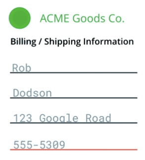
For example, you may have a contact form which indicates invalid inputs by underlining them in red. This color indication doesn't tell the screen reader or users with color vision impairments that something isn't working. The user may be left wondering why the form submission isn't working and give up.

Make sure to alert the user in multiple ways of the specific error. For example, you can add an error message to announce that the specific input is invalid and why. You could also add help text as to what proper input should look like.
You can still underline the invalid input in red, as long as there are additional, non-visual cues.
If you rely heavily on the use of color in your interface, you can discover contrast issues in Chrome DevTools.
Increase contrast and invert colors
For those with low vision, high-contrast modes can make it easier to navigate content on a page. There are a few ways to set up high-contrast.
Both macOS and Windows offer ways to increase the contrast level across the operating system.
Users may also choose to invert the foreground and background colors (for example on macOS), which is especially useful for websites and apps that don't support dark modes.
As developers, you can test to ensure your interface is still visible and usable by turning on these settings and manually verifying the usability.
For example, a navigation bar might use a subtle background color to indicate which page is selected. If you view it in high contrast mode, that subtlety completely disappears and with it goes the reader's understanding of which page is active.

If you meet level AA or higher contrast, your content should still work as expected when the colors are inverted or in high contrast. However, it's still worth testing to ensure the experience is as expected.