

1. Introduction
The Android device ecosystem is always evolving. From the early days of built-in hardware keyboards to the modern landscape of flippables, foldables, tablets, and free-form resizable windows — Android apps have never run on a more diverse set of devices than they do today.
While this is great news for developers, certain app optimizations are required to meet usability expectations and to make for an excellent user experience across different screen sizes. Instead of targeting every new device one at a time, a responsive/adaptive UI and resilient architecture can help make your app look and work great everywhere your current and future users are — on devices of any size and shape!
The introduction of free-form resizable Android environments is a great way to pressure test your responsive/adaptive UI to get it ready for any device. This code lab will guide you through understanding the implications of resizing as well as implementing some best practices to make an app resize robustly and easily.
What you will build
You will explore the implications of free-form resizing and optimize an Android app to demonstrate best practices for resizing. Your app will:
Have a compatible manifest
- Remove restrictions that prevent an app from being able to freely resize
Maintain state when resized
- Maintains UI state when resized by using rememberSaveable
- Avoid unnecessarily duplicating background work to initialize the UI
What you'll need
- Knowledge of creating basic Android applications
- Knowledge of ViewModel and State in Compose
- A test device that supports free-form window resizing such as one of the following:
- A Chromebook with ADB setup
- A tablet that supports Samsung DeX Mode or Productivity Mode
- The Desktop Android Virtual Device emulator in Android Studio
If you run into any issues (code bugs, grammatical errors, unclear wording, etc.) as you work through this codelab, please report the issue via the Report a mistake link in the lower left corner of the codelab.
2. Getting Started
Clone the repository from GitHub.
git clone https://github.com/android/large-screen-codelabs/
...or download a zip file of the repository and extract it
Import Project
- Open Android Studio
- Chose Import Project or File->New->Import Project
- Navigate to where you cloned or extracted the project
- Open the resizing folder.
- Open the project in the start folder. This contains the starter code.
Try the App
- Build and run the app
- Try resizing the app
What do you think?
Depending on your test device's compatibility support, you probably noticed the user experience is not ideal. The app is unable to be resized and is stuck in the initial aspect ratio. What is happening?
Manifest restrictions
If you look in the app's AndroidManifest.xml file, you can see that there are a few restrictions added that are preventing our app from behaving well in a free-form window resizing environment.
AndroidManifest.xml
            android:maxAspectRatio="1.4"
            android:resizeableActivity="false"
            android:screenOrientation="portrait">
Try removing these three problematic lines from your manifest, rebuild the app, and try it again on your test device. You'll notice that the app is no longer restricted from free-form resizing. Removing restrictions like this from your manifest is an important step in optimizing your app for free-form window resizing.
3. Configuration changes of resizing
When your app's window is resized, your app's Configuration is updated. These updates have implications for your app. Understanding and anticipating them can help provide your users with a great experience. The most obvious changes are your app window's width and height, but these changes have implications for aspect ratio and orientation as well.
Observing configuration changes
To see these changes happening yourself in an app built with the Android view system, you can override View.onConfigurationChanged. In Jetpack Compose, we have access to LocalConfiguration.current, which is updated automatically whenever View.onConfigurationChanged would be called.
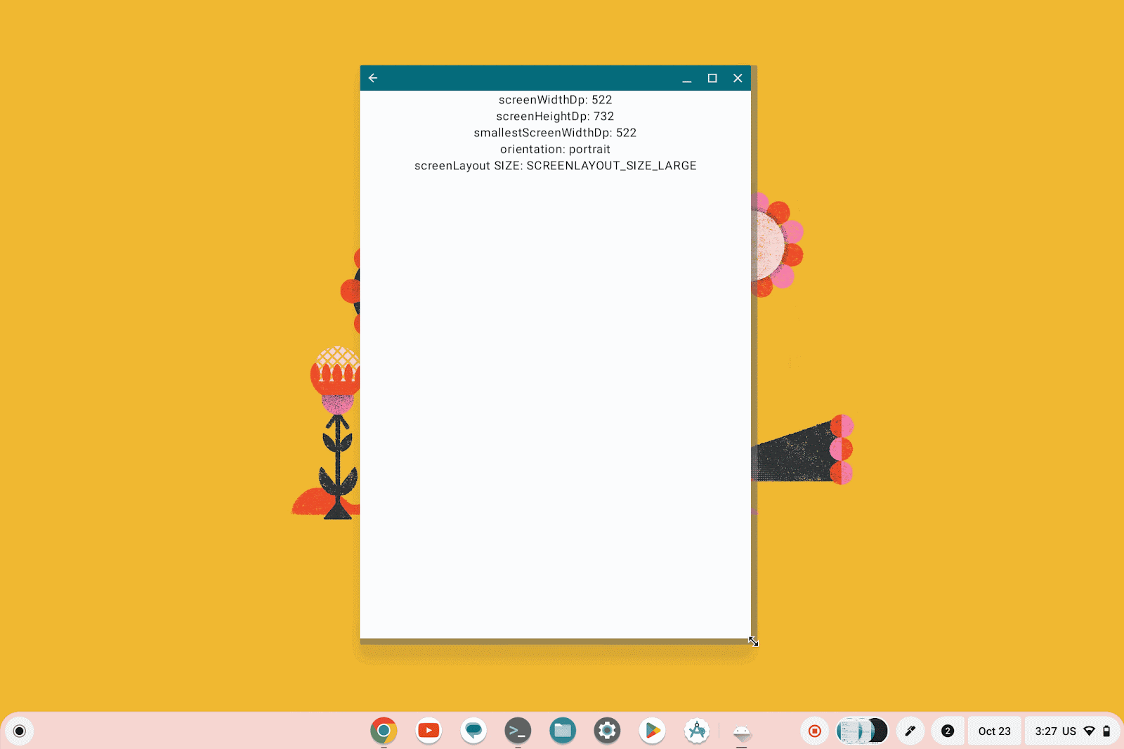
To see these configuration changes in your sample app, add a composable to your app that displays values from LocalConfiguration.current, or create a new sample project with such a composable. An example UI for seeing these would be something like this:
val configuration = LocalConfiguration.current
val isPortrait = configuration.orientation ==
    Configuration.ORIENTATION_PORTRAIT
val screenLayoutSize =
        when (configuration.screenLayout and
                Configuration.SCREENLAYOUT_SIZE_MASK) {
            SCREENLAYOUT_SIZE_SMALL -> "SCREENLAYOUT_SIZE_SMALL"
            SCREENLAYOUT_SIZE_NORMAL -> "SCREENLAYOUT_SIZE_NORMAL"
            SCREENLAYOUT_SIZE_LARGE -> "SCREENLAYOUT_SIZE_LARGE"
            SCREENLAYOUT_SIZE_XLARGE -> "SCREENLAYOUT_SIZE_XLARGE"
            else -> "undefined value"
        }
Column(
    horizontalAlignment = Alignment.CenterHorizontally,
    modifier = Modifier.fillMaxWidth()
) {
    Text("screenWidthDp: ${configuration.screenWidthDp}")
    Text("screenHeightDp: ${configuration.screenHeightDp}")
    Text("smallestScreenWidthDp: ${configuration.smallestScreenWidthDp}")
    Text("orientation: ${if (isPortrait) "portrait" else "landscape"}")
    Text("screenLayout SIZE: $screenLayoutSize")
}
You can see an example implementation in the observing-configuration-changes project folder. Try adding this to your app's UI, run it on your test device, and watch the UI update as your app's configuration changes.
These changes to your app's configuration allow you to simulate quickly moving from the extremes we'd expect with a split screen on a small handset to full screen on a tablet or desktop. Not only is this a good way to test your app's layout across screens, it also allows you to test how well your app can handle rapid configuration change events.
4. Logging Activity lifecycle events
Another implication of free-form window resizing for your app is the various Activity lifecycle changes that will occur for your app. To see these changes in real time, add a lifecycle observer to your onCreate method, and log each new lifecycle event by overriding onStateChanged.
lifecycle.addObserver(object : LifecycleEventObserver {
        override fun onStateChanged(source: LifecycleOwner, event: Lifecycle.Event) {
        Log.d("resizing-codelab-lifecycle", "$event was called")
    }
})
With this logging in place, run your app on your test device again, and look at logcat as you try to minimize your app and bring it to the foreground again.
Observe that your app is paused when it's minimized, and then resumed again when it's brought to the foreground. This has implications for your app that you'll explore in the upcoming section of this codelab focused on continuity.

Now look at Logcat to see which activity lifecycle callbacks are called when you resize your app from its smallest possible size to its largest possible size
Depending on your test device, you may observe different behaviors, but you probably noticed that your activity is destroyed and recreated when the size of your app's window is changed significantly, but not when it's changed slightly. This is because, on API 24+, only significant size changes result in Activity recreation.
You've seen some of the common configuration changes you can expect in a free-form windowing environment, but there are other changes to be aware of. For example, if you have an external monitor connected to your test device, you can see your Activity is destroyed and recreated to account for configuration changes such as display density.
To abstract some of the complexity associated with the configuration changes, use higher level APIs such as WindowSizeClass for implementing your adaptive UI. (See also Support different screen sizes.)
5. Continuity - Maintaining composables' internal state when resized
In the previous section, you've seen some of the configuration changes your app can expect in a free-form window resizing environment. In this section, you'll keep your app's UI state continuous throughout these changes.
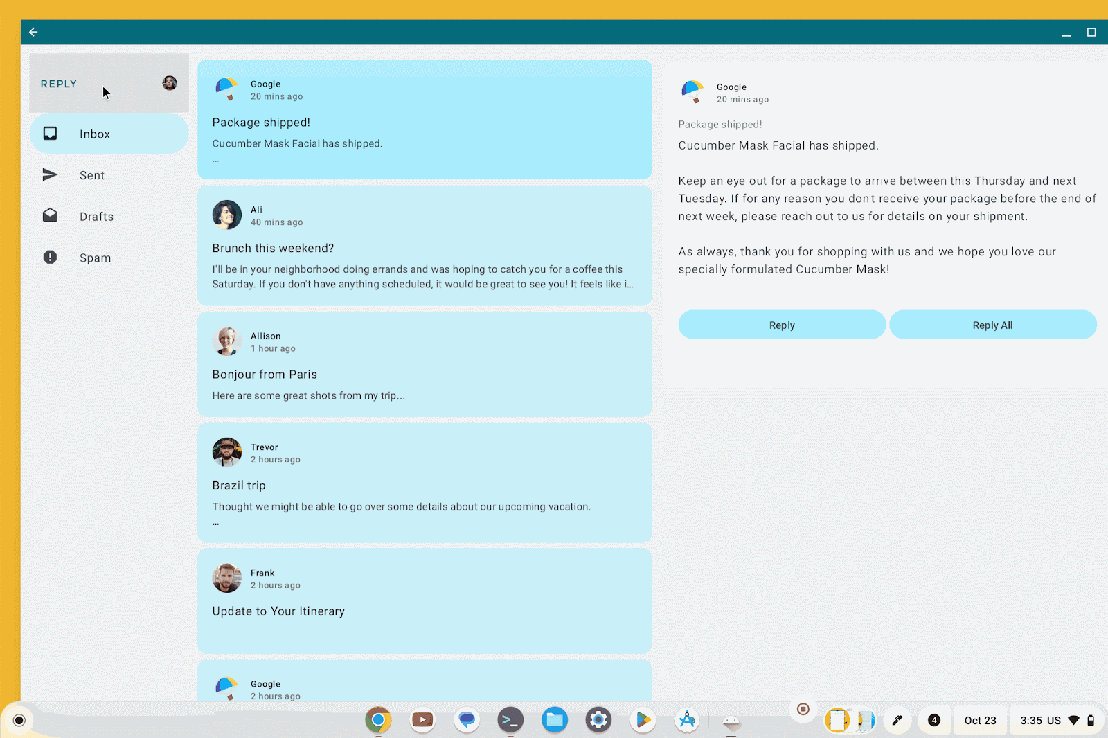
Start by making the NavigationDrawerHeader composable function (found in ReplyHomeScreen.kt) expand to show the email address when clicked.
@Composable
private fun NavigationDrawerHeader(
    modifier: Modifier = Modifier
) {
    var showDetails by remember { mutableStateOf(false) }
    Column(
        modifier = modifier.clickable {
                showDetails = !showDetails
            }
    ) {


        Row(
            horizontalArrangement = Arrangement.SpaceBetween,
            verticalAlignment = Alignment.CenterVertically
        ) {
            ReplyLogo(
                modifier = Modifier
                    .size(dimensionResource(R.dimen.reply_logo_size))
            )
            ReplyProfileImage(
                drawableResource = LocalAccountsDataProvider
                    .userAccount.avatar,
                description = stringResource(id = R.string.profile),
                modifier = Modifier
                    .size(dimensionResource(R.dimen.profile_image_size))
            )
        }
        AnimatedVisibility (showDetails) {
            Text(
                text = stringResource(id = LocalAccountsDataProvider
                        .userAccount.email),
                style = MaterialTheme.typography.labelMedium,
                modifier = Modifier
                    .padding(
                        start = dimensionResource(
                            R.dimen.drawer_padding_header),
                        end = dimensionResource(
                            R.dimen.drawer_padding_header),
                        bottom = dimensionResource(
                            R.dimen.drawer_padding_header)
                ),


            )
        }
    }
}
When you've added the expandable header to your app,
- run the app on your test device
- tap the header to expand it
- try resizing the window
You'll see that the header loses its state when resized significantly.
The UI state is lost due to the fact that remember helps you retain state across recompositions, but not across activity or process recreation. It's common to use state hoisting, moving state to a composable's caller to make composables stateless, which can avoid this issue entirely. With that said, you may use remember in places when keeping UI element state internal to composable functions.
To resolve these issues, replace remember with rememberSaveable. This works because rememberSaveable saves and restores the remembered value to savedInstanceState. Change remember to rememberSaveable, run your app on the test device, and try resizing the app again. You'll notice that the state of the expandable header is preserved throughout resizing, as intended.
6. Avoiding unnecessary duplication of background work
You've seen how you can use rememberSaveable to preserve composables' internal UI state through configuration changes which can happen frequently as a result of free-form window resizing. However, an app should often hoist UI state and logic away from composables. Moving ownership of state to a ViewModel is one of the best ways to preserve state during resizing. As you hoist your state into a ViewModel, you may encounter problems with long-running background work such as heavy file system access or network calls that are necessary to initialize your screen.
To see an example of the kinds of problems you might run into, add a log statement to the initializeUIState method in the ReplyViewModel.
fun initializeUIState() {
    Log.d("resizing-codelab", "initializeUIState() called in the viewmodel")
    val mailboxes: Map<MailboxType, List<Email>> =
        LocalEmailsDataProvider.allEmails.groupBy { it.mailbox }
    _uiState.value =
        ReplyUiState(
            mailboxes = mailboxes,
            currentSelectedEmail = mailboxes[MailboxType.Inbox]?.get(0)
                ?: LocalEmailsDataProvider.defaultEmail
        )
}
Now run the app on your test device, and try resizing your app's window several times.
When you look at Logcat, you'll notice that your app shows the initialization method has run several times. This can be a problem for work you only want to run once to initialize your UI. The additional network calls, file I/O, or other work can hinder the device's performance, and cause other unintended problems.
To avoid unnecessary background work, remove the call to initializeUIState() from your activity's onCreate() method. Instead, initialize the data in the init method of the ViewModel. This ensures that the initialization method runs only once, when ReplyViewModel is first instantiated:
init {
    initializeUIState()
}
Try running the app again, and you can see the unnecessary simulated initialization task runs only one time, regardless of how many times you resize your app's window. This is because ViewModels persist beyond the lifecycle of the Activity. By running initializing code only once at the creation of the ViewModel, we separate it from any Activity recreations and prevent unnecessary work. If this were actually an expensive server call or a heavy file I/O operation to initialize your UI, you'd save significant resources and improve your user experience.
7. CONGRATULATIONS!
You did it! Great work! You have now implemented some best practices for enabling Android apps to resize well on ChromeOS and other multi-window, multi-screen environments.
Sample Source Code
Clone the repository from GitHub
git clone https://github.com/android/large-screen-codelabs/
...or download a zip file of the repository and extract it