
 ☰
🔍
☰
🔍

15 May 2024
The promise of Jetpack Compose has always been that a modern toolkit designed to build native UI can help you build better apps faster and easier. As more and more of you - 40% of the top 1k apps, in fact - use (and love) Compose, we’ve been working to extend those benefits you’re seeing on mobile to also help you build across form factors as well. At Google I/O 2024, we announced a lot of new updates for Compose that help you build across form factors, including Compose APIs to support adaptive layouts, and new updates for Compose TV and Wear OS. From foldables to wearables to TVs, Compose is delivering features built to make Android development faster and easier. Apps like yours are already using Compose to support more screens with less code.
Yesterday, we announced a new set of Compose APIs for building adaptive layouts, using Material guidance. These APIs, now in Beta, provide new layouts and components that adapt as users expect when switching between small and large window sizes.
The libraries provide 3 new scaffolds that adapt to the different window sizes that users can place apps in on different types of devices, from phones to foldables to tablets and more.

NavigationSuiteScaffold helps make it easier to build navigation UI by automatically complying with Material guidelines to provide your users with an optimal experience based on their window size.
Material guidelines recommend using a navigation bar at the bottom of compact width windows such as most phones and a navigation rail on the size of medium width and expanded width windows. It used to be up to each app individually to handle swapping between these components; now NavigationSuiteScaffold does this for you by switching between the components when the window size changes.
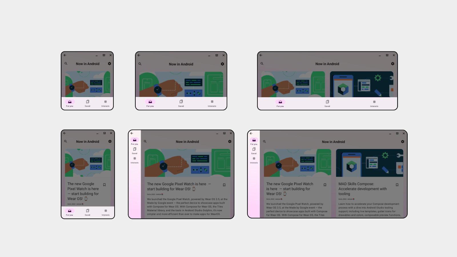
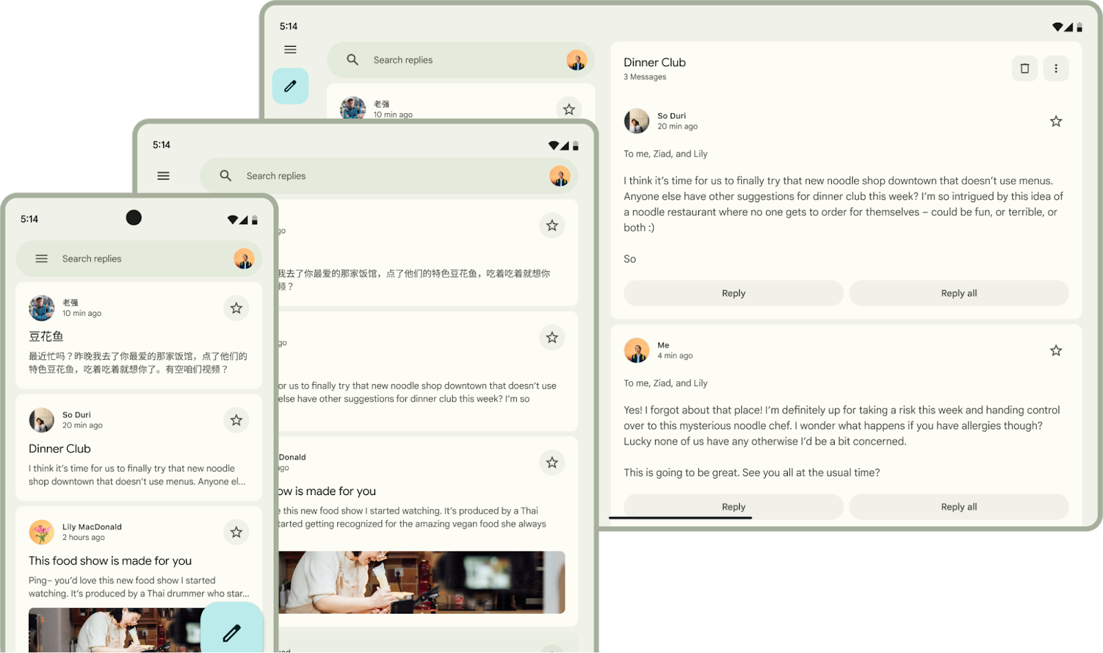
The new library also has ListDetailPaneScaffold and SupportingPaneScaffold, which help you implement canonical layouts that we recommend in many cases - list-detail and supporting pane.
On a phone, you usually organize your app flow through screens. For example, clicking on an item on your list screen brings you to the detail screen.

When adapting to different window sizes, it helps to think of your app in terms of panes rather than screens. For a compact window size class, such as a phone, you might only display one pane. For an expanded window size class, you might show two, or more panes at the same time. ListDetailPaneScaffold and SupportingPaneScaffold help you build apps that easily switch between one and two pane layouts.
You can learn more about all three of these APIs and how to get started with them in the “Building UI with the Material 3 adaptive library” and “Building adaptive Android apps” technical sessions.
“Integrating SupportingPaneScaffold was effortless and quick. It enabled us to seamlessly organize primary and secondary content on To-Dos. Depending on the window size class, the supporting pane adjusts the UI without any additional custom logic. Delighting our users regardless of what device they use is a key priority for SAP Mobile Start.”
- Software Engineer on SAP Mobile Start
In the past year, adoption of Compose for Wear OS has grown 200%, showcasing the ease with which Compose allows developers to build for the watch form factor.
Recently we’ve seen top apps such as WhatsApp, Gmail and Google Calendar built entirely using Compose for Wear OS, and it’s the recommended way for building user interfaces for Wear OS apps.
At this year’s Google I/O, Compose for Wear OS is graduating visual improvements and fixes from beta to stable.
In the past year, we’ve added features such as SwipeToReveal, to give users additional means for completing actions, an expandableItem, to enhance the use of the smaller screen and show additional information where needed, and a range of WearPreview supporting annotations, for ensuring your app works optimally across the range of device sizes and font scales.

You can get started with Compose for Wear OS by taking the codelab and learn more about all the latest updates for Wear OS via the technical session.
At Google I/O ‘24, we announced that Compose for TV 1.0.0 is now available in beta. Compose for TV is our recommended approach for building delightful UIs for Android TV OS. It brings all of the benefits of Jetpack Compose to your TV apps, making building beautiful and functional experiences in your app much faster and easier.
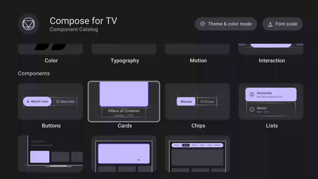
The latest updates to Compose for TV include better performance, input support, and a whole range of improved components that look great out of the box. New in this release, we’ve added lists, navigation, chips, and settings screens. We’ve also updated the developer tools in Android Studio to include a new project wizard to get a running start with Compose for TV.
The new TV Material Catalog app lets you explore components in Compose for TV with different themes and layouts, and our updated JetStream sample shows how it all fits together.
You can get started with Compose for TV by checking out the dedicated blog, the technical session or taking a look at the integration guides.
Jetpack Glance 1.1.0 is now available in RC, bringing a new unit test library, Error UIs, and new components.
We have also released new Canonical Widget Layouts on GitHub, which are built on top of the Glance components, to allow you to get started faster with a set of layouts that align with best practices.
The first set of layouts are delivered as code samples and a matching figma design kit on Android UI Kit with more layouts coming later this year.
Lastly, we have new design guidance published on the UI design hub—check it out!
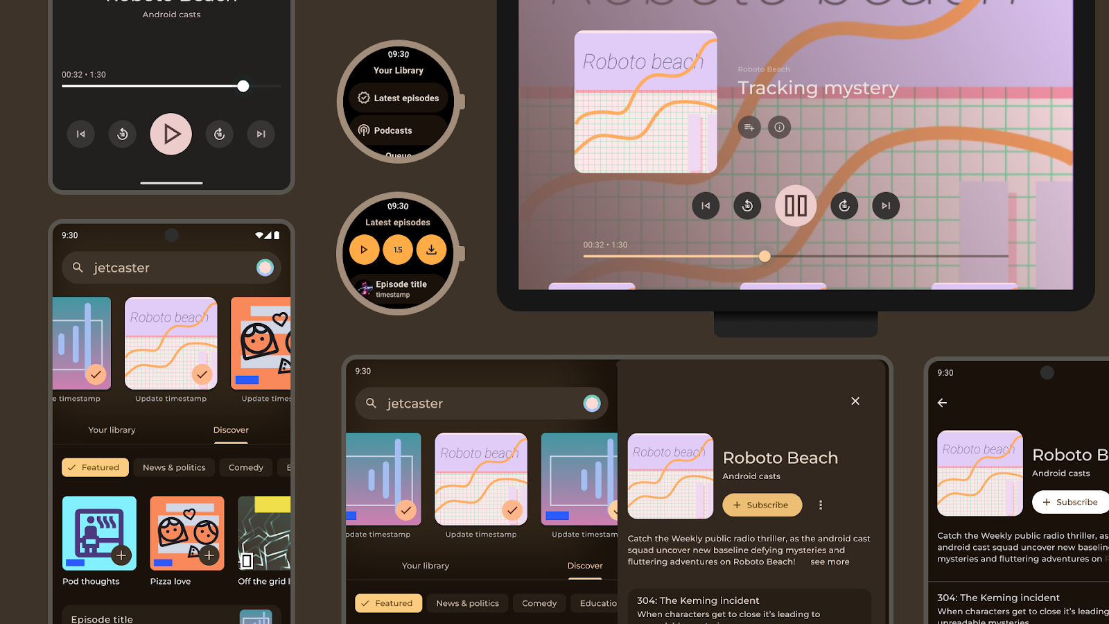
We have updated Jetcaster—one of our Compose samples—to adapt across phone, foldable and tablet screens, and added support for TV, Wear and homescreen widgets with Glance. Jetcaster showcases how Compose helps you to build across a range of devices using a shared architecture in a single project.
See how you can extract elements such as your data layer, and design system, to promote reuse and consistency while delivering an experience tailored to different form factors. You can dive directly into the code on GitHub.
With these updates to Compose to help you build for tablets, foldables, wearables and TVs, it is a great time to get started! These technical sessions are a great place to learn more about all the latest updates:
Learn more about how SoundCloud supported more screens using 45% less code with Jetpack Compose!
Android Developers


 Google Play


 Posted by Maru Ahues Bouza, Product Management Director, Android Developer

